This is a training session about making one's project prominent using IT tools and media practices to disseminate information online. The ways and tools to disseminate information will be supplemented by intellectual property rights reminder as well as out-of copyright works and use conditions.
Short training session (STS)
Editorial usability or the art of building an information architecture
Card's author : Outils-réseaux
Card's type of licence :
Creative Commons BY-SA
Description : Many are the people who neglect editorial usability and focus all their attention on writing techniques, believing these are sufficient to share and publish quality content on the Internet. However, the specificity of reading on a screen leads to reinterpreting the way information is valued and the way it can be structured to make it accessible to Internet surfers. And this is precisely where editorial usability kicks in: reflecting on the best technique that can be borrowed to adapt to the technical “constraints” of the Internet and to facilitate the browsing experience to users as much as possible focusing the work especially on how contents are organised. In summary, it is about creating a text scenario that pushes users to read in greater depth.
The challenges of editorial usability
Eve Demange, the author of the blog Plume Interactive is a specialist in this field in France, and explains the specificities and the challenges of editorial usability: "Architecture improves the usability of websites by reviewing some elements such as the structure of information, links to other pages, the design. Editorial usability ensures that the words used to guide browsing are clear enough, short enough, that they allow visitors to find their way easily. It is not about drafting or re-writing a text adapting it to web reading (even if this does improve editorial usability too); it is all about weighting the words. It is a different job, specific to web media. A good web writer can do this job, but also an experienced web designer or a specialist in usability that is sensitive to the editorial part."
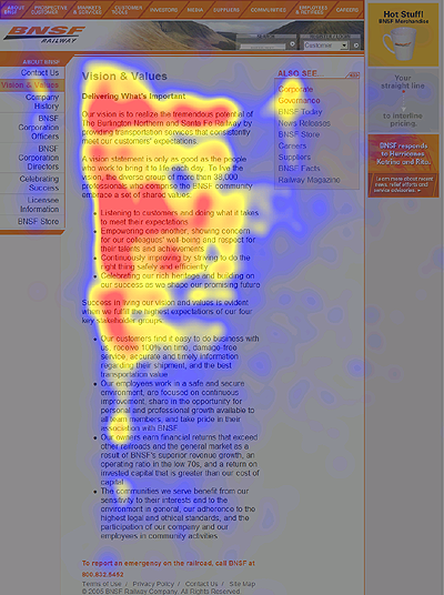
This field finds its basis on the fact that people surfing the net read and take in information differently on-line. Eyetracking carried out a study, lead by Jakob Nielsen, to try and capture the eye movements on a screen and analyse what the user is really looking at when reading a website. These movements are illustrated with coloured areas. So, the read areas are those that were looked at the most by internet users, the yellow areas deserved less attention, the blue areas even less. As for the grey areas, they simply went unseen. If one can trust this study, people surfing the net would tend to scan the page, reading diagonally and stopping at the top of the page, the first paragraph and the beginning of the next paragraphs.
Other studies have shown that long before stopping at illustrations, Internet users would stop at the titles and text. What can be deduced from different studies is that it is words that guide internet users' actions.
Some good practices
Without going into the details of the several studies made on this topic, there are some base principles to optimize Internet surfers' browsing, to make reading easier and encourage users to visit a site again. In a nutshell, these studies point out two main aspects: visual comfort and content accessibility (i.e. the way to facilitate content comprehension).
Regarding visual comfort, there are four practical recommendations:
Taking care not to increase the information load of an article using too many colours and fonts or placing background images or animations that result overwhelming.
Optimising the colours used privileging a positive contrast (clear background/dark letters) rather than a negative contrast (dark background/clear letters). A positive contrast is less straining on eyesight.
Writing in lower case letters rather than in capital letters, for the same reasons mentioned above.
Creating visual gaps to catch the user's attention by using lists of bullet points, head tags (h1, h2, strong...) that give significance to the text, block quotes, etc.
To improve content accessibility it is advisable to:
Organise contents in a way that the user can tell the start from the end of the different topics easily.
Break up the text by displaying information hierarchically: short and descriptive titles (they should provide information to the user on what to find), etc.
Use relevant and explicit external links to offer more information on the topic and thus enrich the content.
Place important titles and information at the start of the line.
Privilege several relatively short articles to one long one with two much information or offer a printable format (PDF, for example) for long texts.
Illustrate an article since an image accompanying a text can considerably improve memorizing information. It stimulates learning the information.
Use a variety of sentence constructions to highlight the words conveying the message.


